THE ANSWER IS Simple Campaign / Campaign Direction
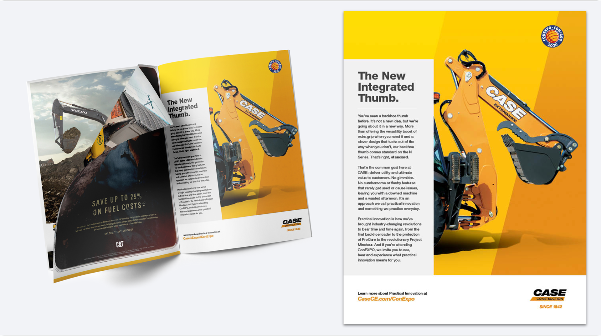
Coming into ConExpo 2020, a construction industry trade show known to be the largest trade show in the world, CASE Construction was having a bit of an identity crisis. Wanting an update to their tired and aging branding, they were looking for a facelift that represented who they were and what they were hoping to become — not just in look, but in approach and tone.
So after pouring through years of customer interviews and internal documents, I concepted and proposed The Answer is Simple campaign, highlighting the one overarching promise of the CASE Brand: when it gets to you, the mechanic, the contractor, the machine operator, the owner, your experience with CASE is easy, intuitive, and simple. “It just makes sense,” as one customer put it. So, working with CASE makes doing your job and running your business easier.
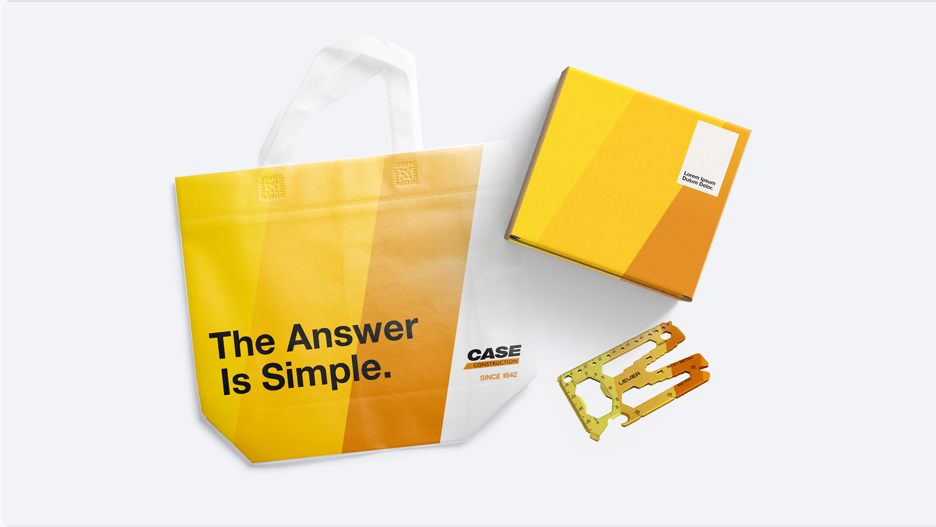
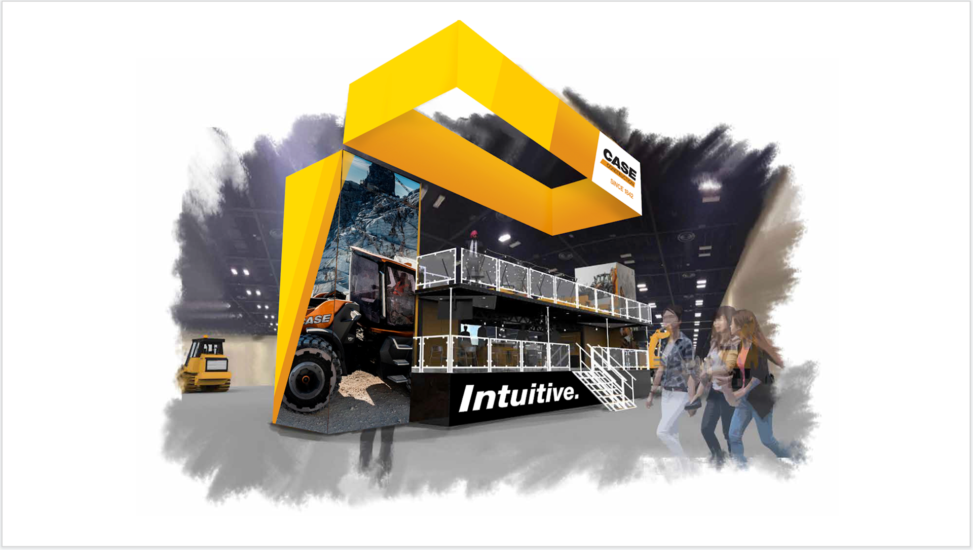
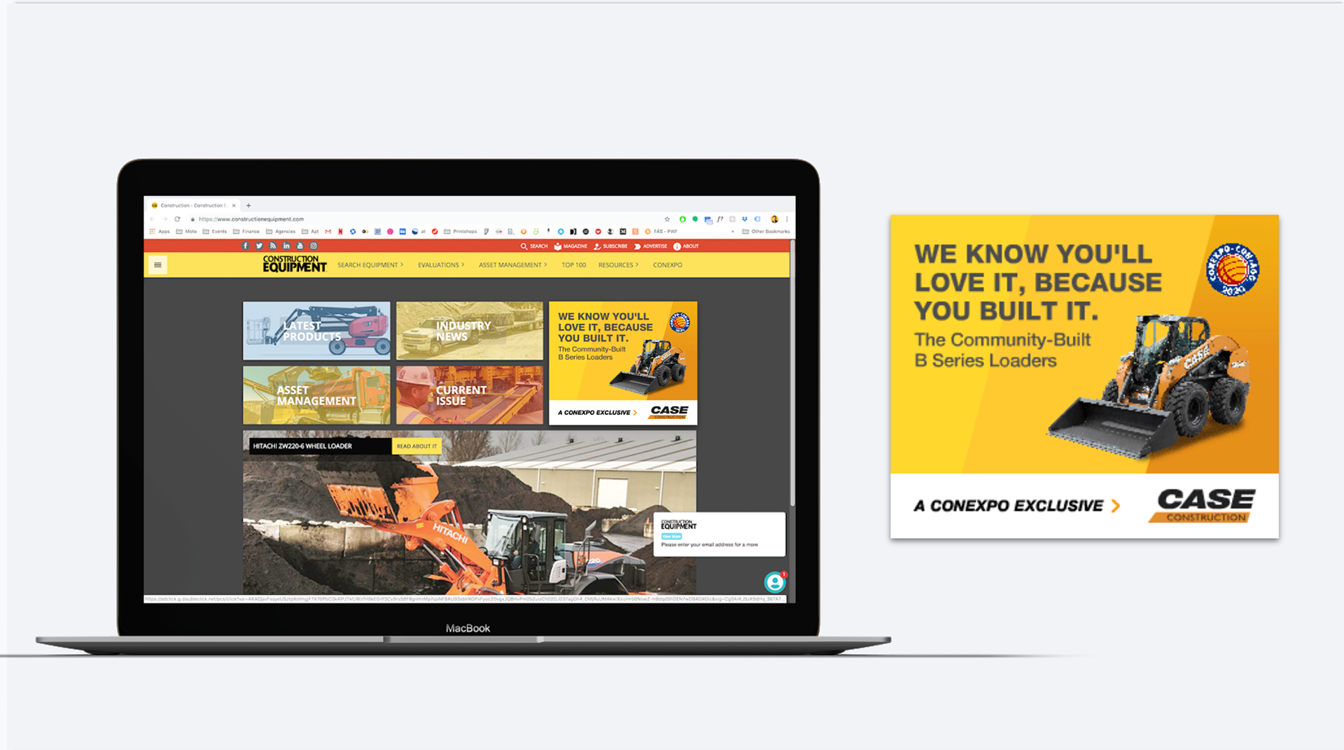
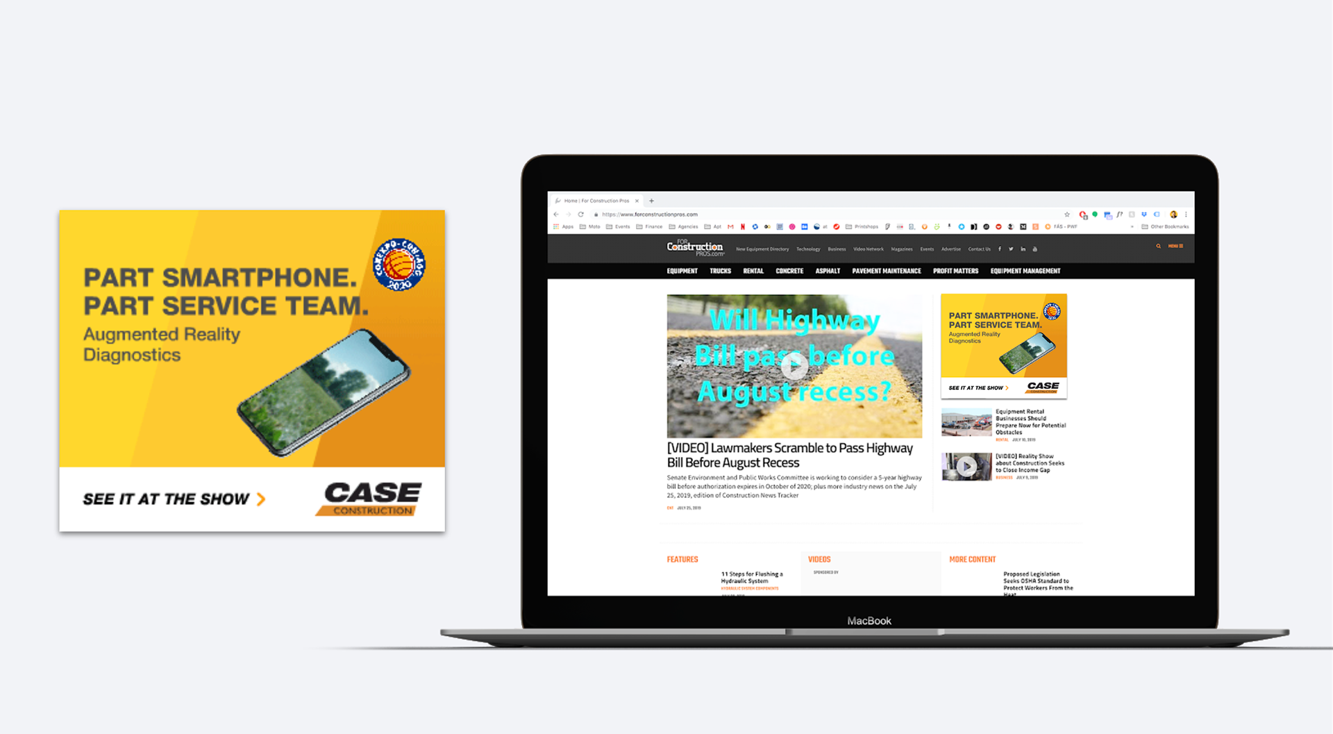
Complimenting this message of simplicity was a bright, swiss-style inspired design that allowed the brand’s primary font family, Helvetica Neue, and it’s new strong, bright oranges and yellows, to really shine in stark contrast to the black, brown, green, and earth tones used by most of the other OEMs in the industry.
Design, Art Direction, Copywriting all done by me.
