AUTOMOTIVE SYSTEMS, INC. / IDENTITY AND WEB DESIGN
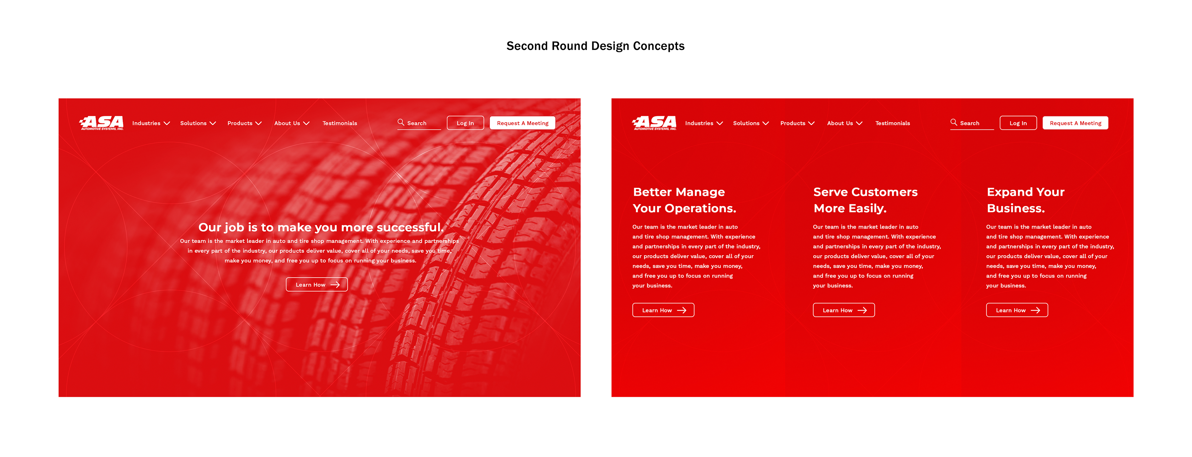
Automotive Systems, Inc., otherwise known as ASA, came to us with a new product and a desire for change. With some of the most all-encompassing and innovative solutions on the market, they felt that their entire brand presence was lagging behind their software offerings. So, with the launch of their new product, GTX, they wanted a total facelift — a new branded-house approach to their company and their software and to go along with it, a new website.
The challenge? It all needed to be done at near-breakneck speed: kickoff to full launch in less than 2 months.
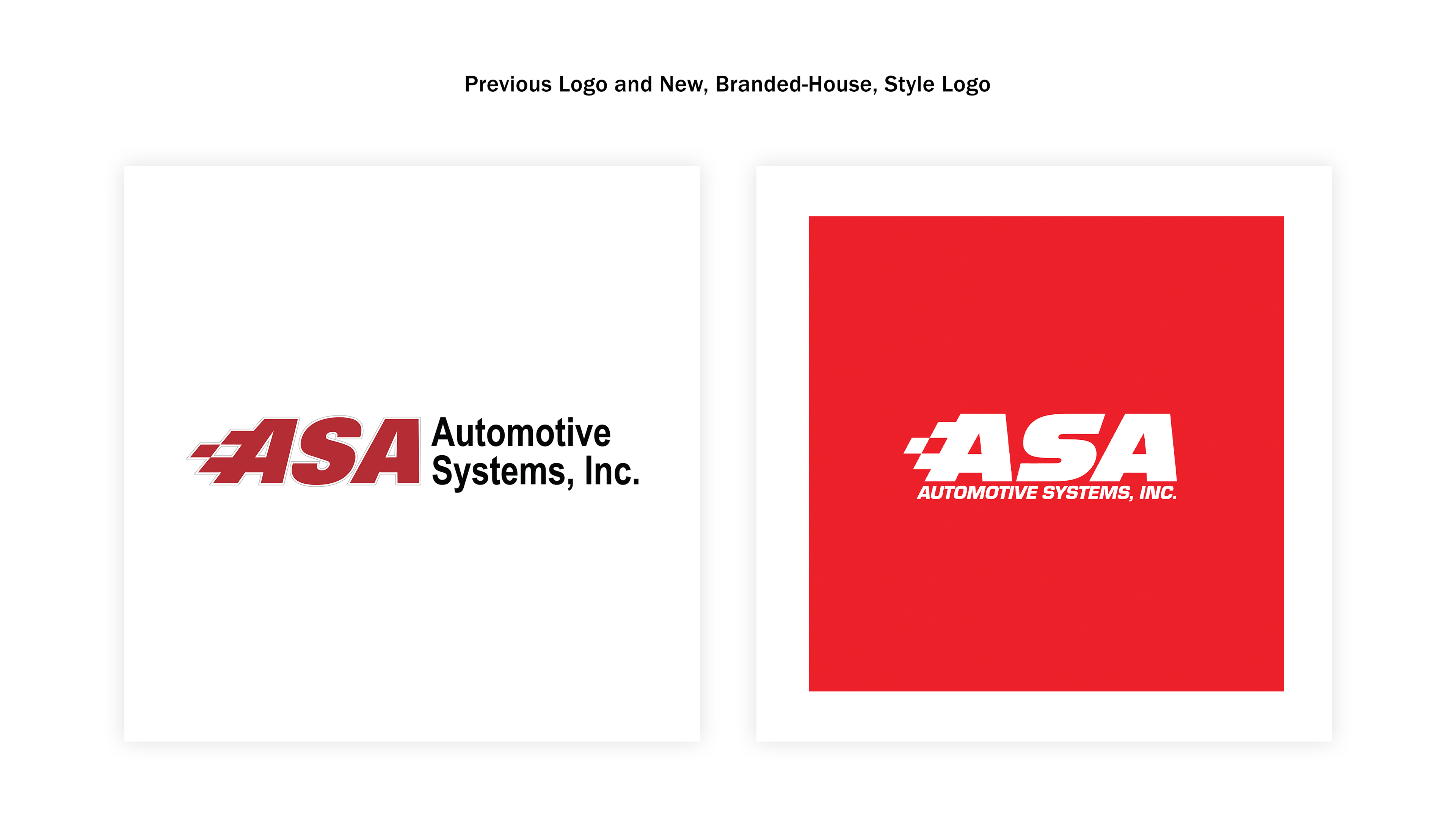
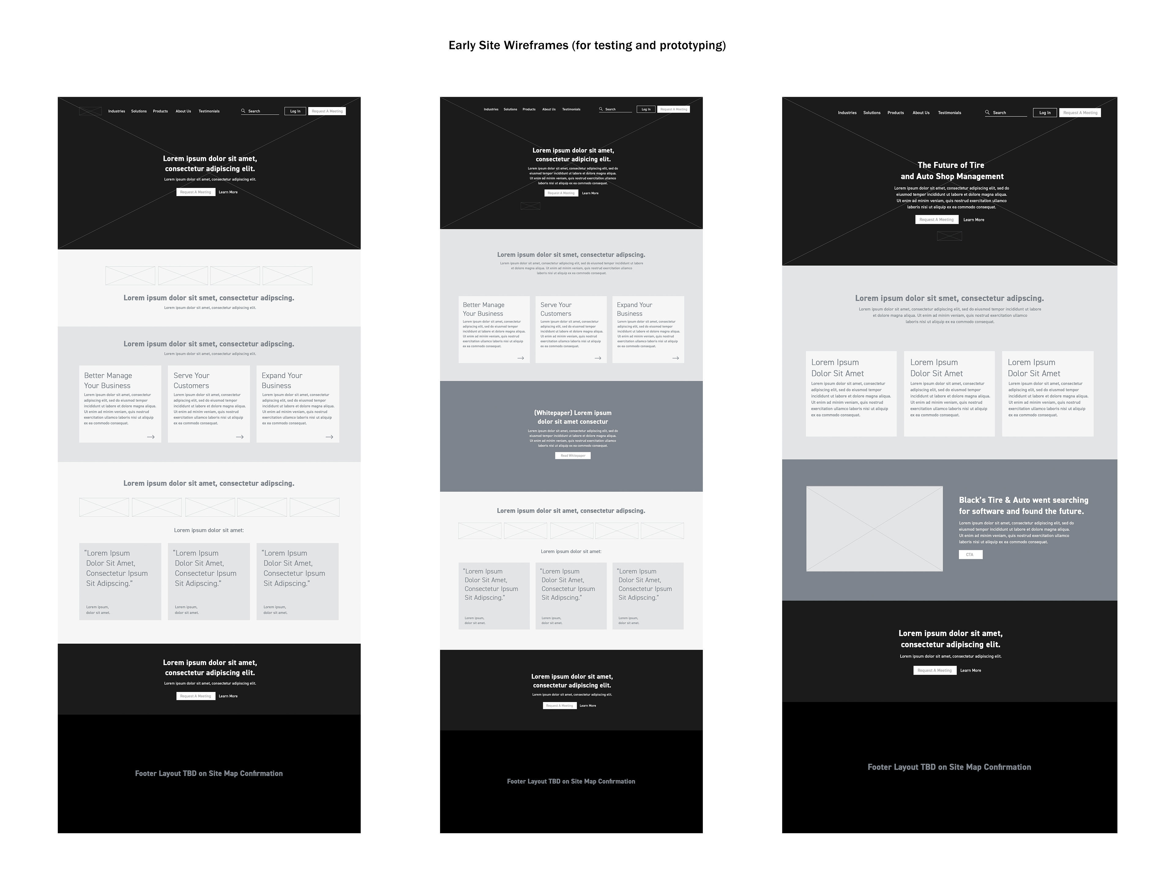
After modernizing their logos and crafting a rough, but workable, new identity, we set to work on the website. For the sake of clarity and speed, we defined one clear conversion goal for the site: scheduling an appointment. Because of the nature of the product offering, it was determined that the best journey would be to connect a potential customer to an experienced salesperson; someone who could help determine which tier and type of product they truly needed while considering a host of other qualifying details. With that in mind, every page was designed to facilitate and guide users to this interaction. The site itself was built with an expanded design system of modular components to ease design and development. Plug-and-play sections guide users down to the same conversion CTA, no matter which page you find yourself on. Sadly, at the speed we were working to create the 22-page site, we were not able to open the floor to a more nuanced and considered UX process. We decided to run with the site as it is and incorporate feedback into improving it after go-live.
See the full thing live at ASAauto.com
PROCESS: SOME SHOTS ALONG THE WAY


